Eye of the Beholder

Here is something that happened to me just recently but has reoccurred throughout my design career. The things I care about. The things I think are cool or good or difficult or clever are not always what others think are cool, good, difficult, or clever.

Most people walk around in their own bubble of interests. Most people are not designers. If you work with a team, what matters to any particular member of the team is what that person is interested in.  It may take you 15 minutes to put together that flyer, but if that flyer is promoting this team member’s project, then that is all that matters.

My advice to you is to treat everyone’s project like it’s important. Don’t down play any work you do. Don’t sell yourself short because you thought it was easy. Put your best work forward always even if it isn’t what you consider challenging or especially interested. You’re helping to interpret and sell their dream, and that’s important. Always. That’s challenging. Always. Even if you did it before.

For the hard and interesting stuff, keep a side hustle. Find a way to fit in the work that you really want to do, the work that challenges you, the work you find interesting or cool, the work that makes you feel like a pro. You also need to please yourself, and the tough stuff will do that. Make sure you fit it in even if it doesn’t pay the bills because it will feed your soul.
Society of Illustrators Fall 2017 Shows

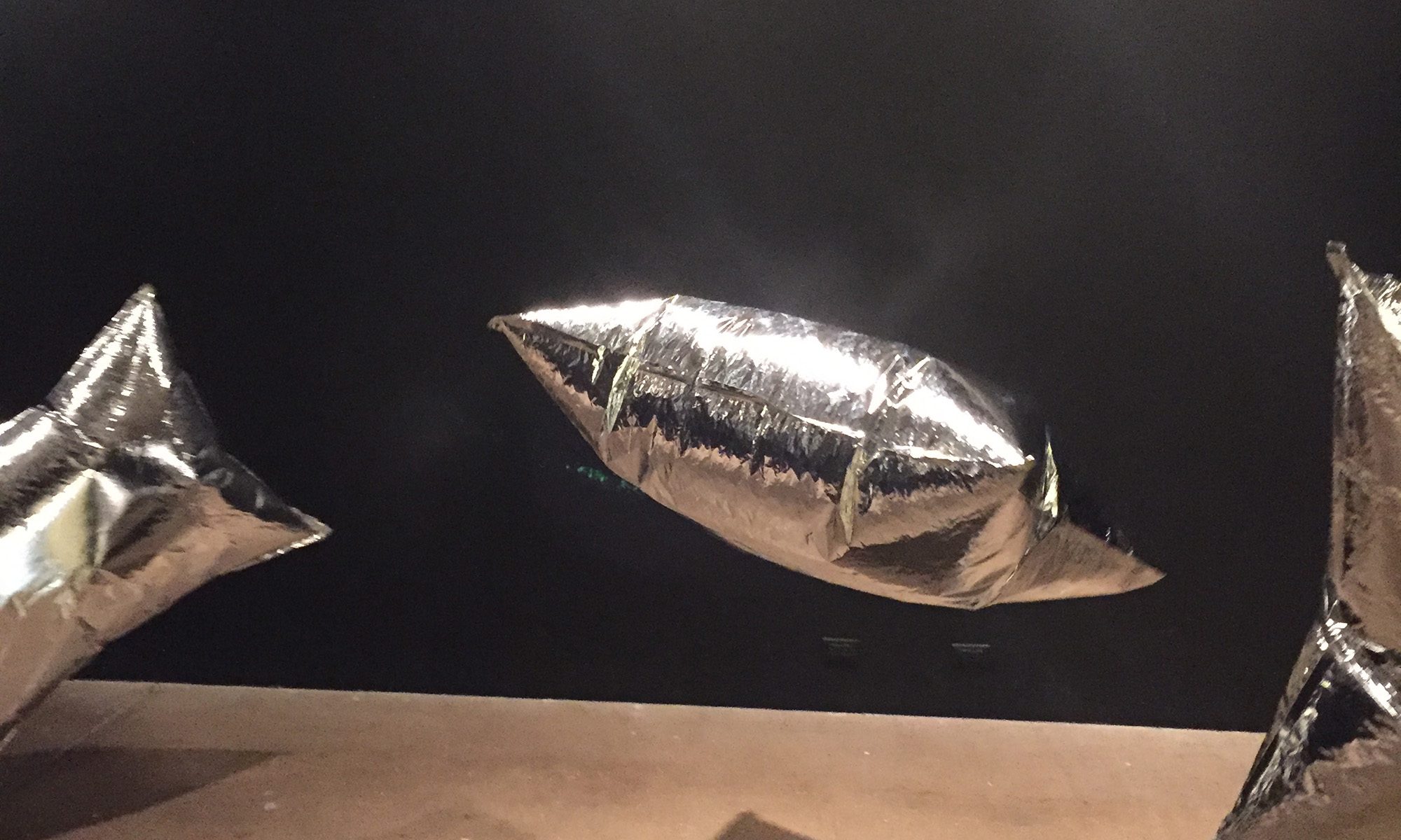
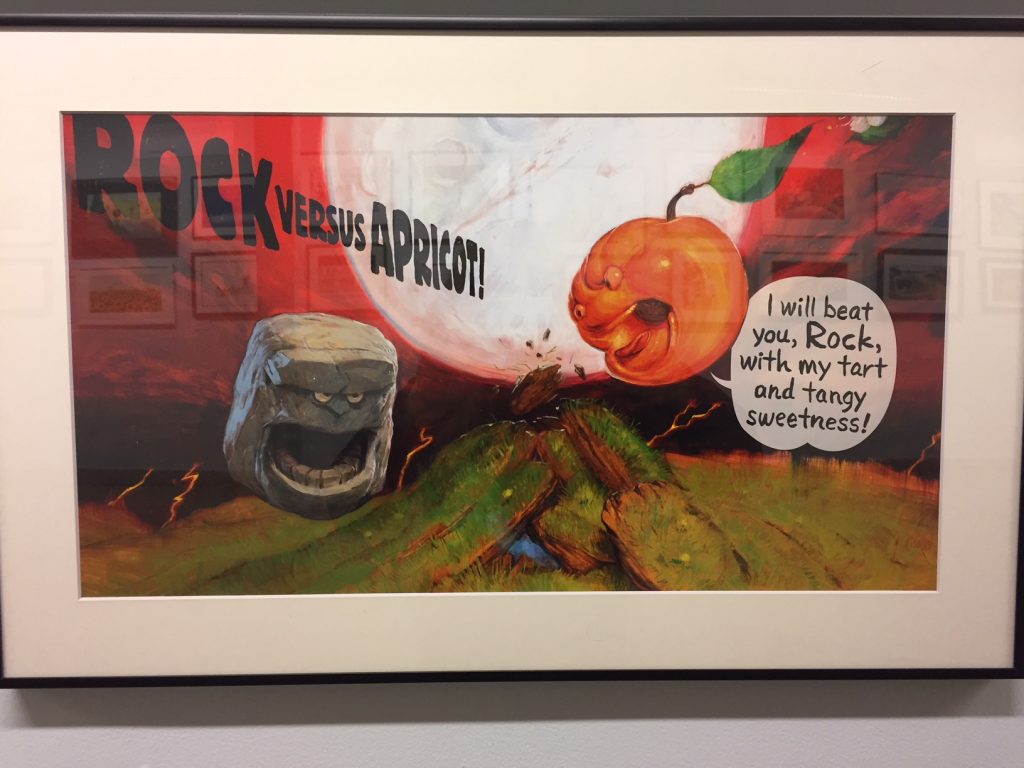
In November 2017, my husband and I went to New York City for a Jets Thursday Night game. We spent three days total and filled the first one with, among other things, a trip to the Society of Illustrators (128 E 63rd St, New York, NY 10065) for their fall show. The show, which featured children’s book illustrations, was due to officially open that night, so the two floors of framed illustrations didn’t all contain information about the author or the book involved. The majority of the placards were in a tiny pile on the lower level waiting to be installed. This actually added to the show because you really viewed the work disconnected from the book.

I asked a curator how book authors and illustrators are connected. She said that the illustrator was the author’s choice and that authors frequently had long standing relationships with artists. This made sense when you looked at the variety of styles evident in the illustrations. Some were hand drawn and others were digital. There was even some photography combined with illustration and some mixed media.

Society of Illustrators Fall Show - Children's book illustrations
How amazing is this? The placard wasn’t installed yet, so I have no idea who did it or why. It’s just fantastic by itself.

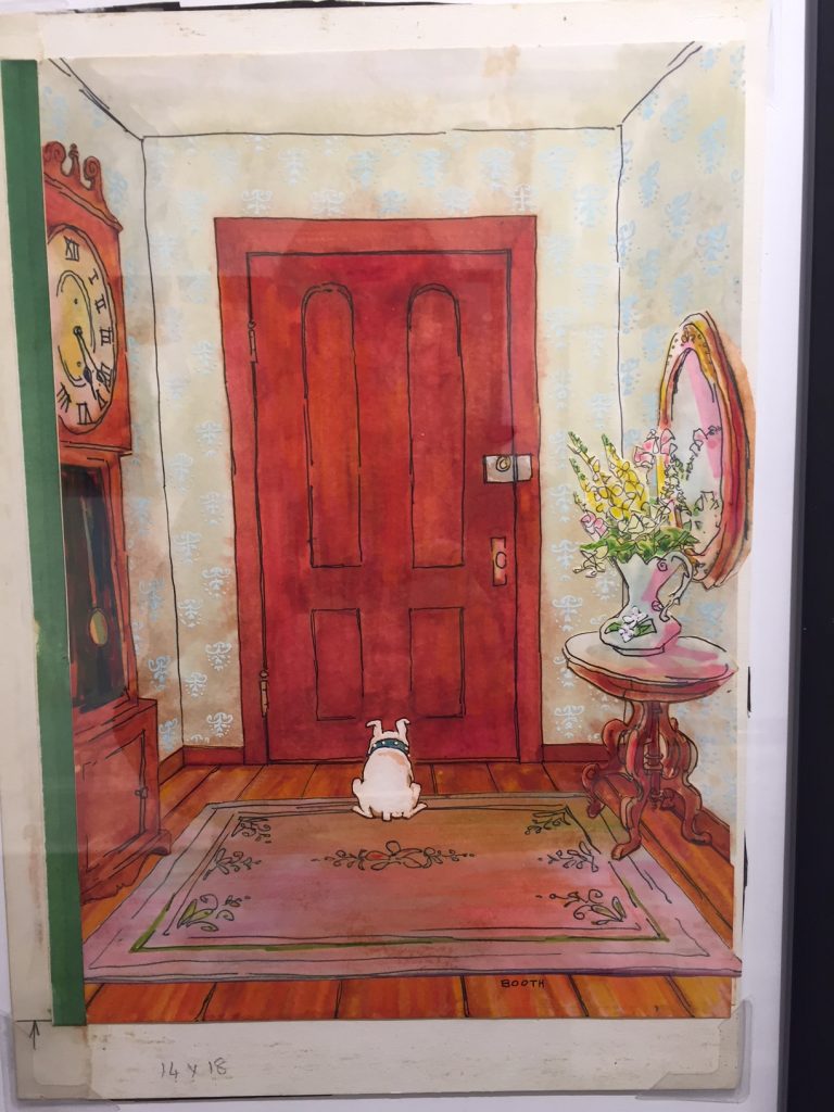
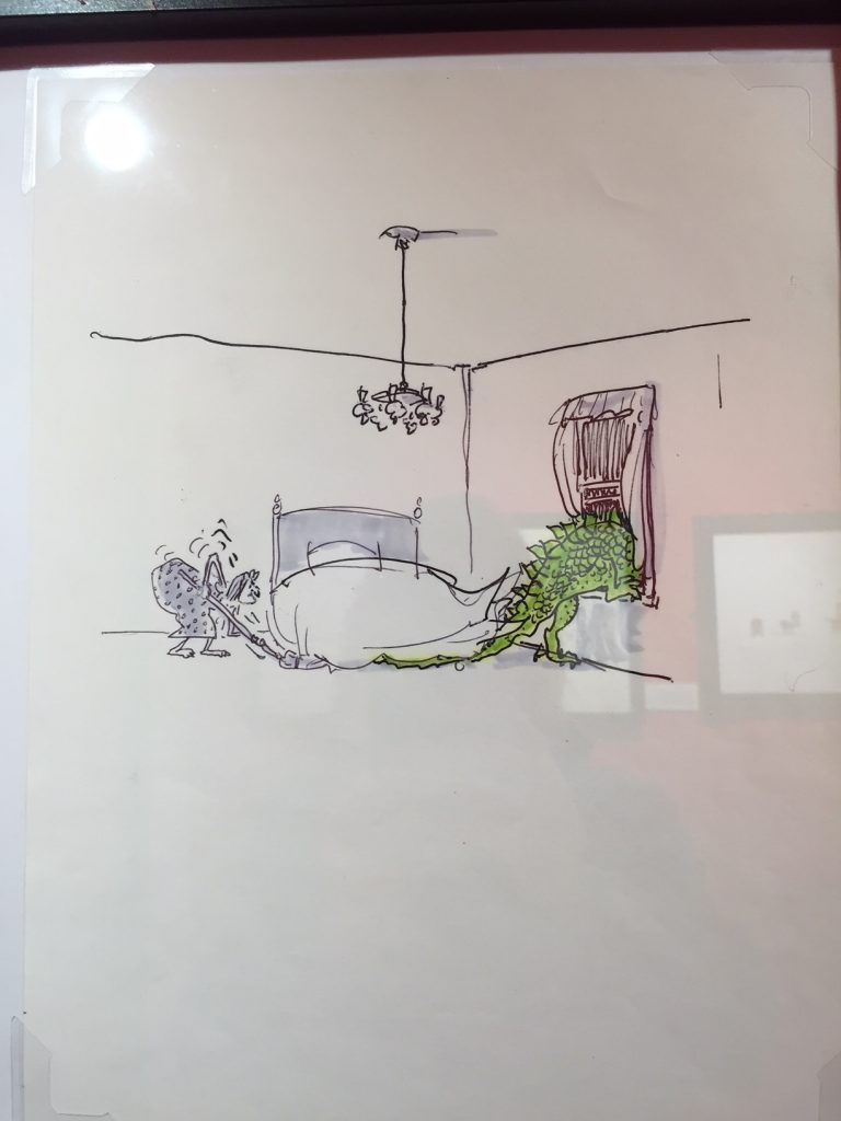
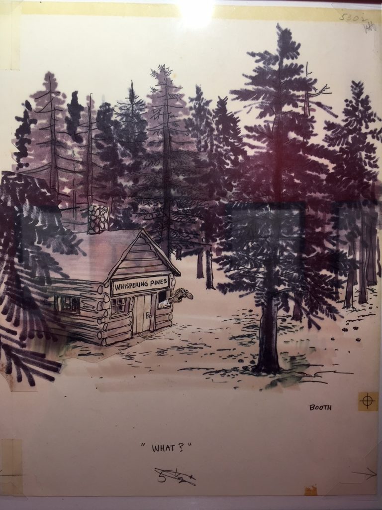
The second floor was a George Booth show. Booth was an illustrator best known for New Yorker cartoons and covers, and this show was small but lovely. The hand drawn comps were on display with no explanation. Again, art to be enjoyed for it’s own sake.

Waiting by George Booth
Waiting, a lovely New Yorker Cover by George Booth.
George Booth
This one made me laugh out loud.
What? George Booth
Wait for it…

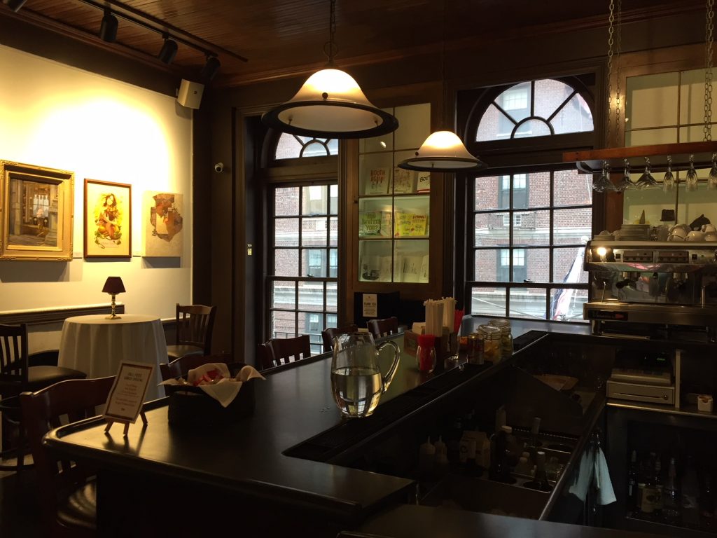
The third floor was a restaurant and bar, the 128 Bar and Bistro, decorated with the society’s annual member show. The theme this year was “Food Fight”, and each artist interpreted it very differently. This was art created just for consideration for the show, not necessarily a commission.

This gallery was a reminder that there are places for talented artists that you might not expect. It also probably pays to network and build relationships with unlikely allies, like children’s book authors. Always keep your eyes open for potential projects.

128 Bar and Bistro
The 128 Bar and Bistro would be a lovely place to visit regardless of the shows available at the Society of Illustrators.

Project Runway: Mind Your Own Business Edition

Project Runway is one of the few shows I wait to watch. I know when the next season is being released, and I’ve seen all 16. It inspired me to take a sewing and pattern making class and buy a sewing machine. However, more than fashion, I think it is a show about leadership and conduct. It’s about doing the right thing and acting with courage and sometimes, minding your own store.

On the October 5, 2017 show, a talented contestant named Margarita becomes fixated with the thought that another contestant, Claire, is cheating by copying designs and measuring her own clothes in order to make patterns. Consulting a pattern book is verboten, but copying is in the eye of the beholder. Regardless, the situation so unnerves Margarita that she ruins some fabric and ends up making a sub-par design. She also shares her suspicions with another contestant, Michael, who is also furious.

In this particular show, Margarita has immunity, so she is not eliminated. However, the object of her fixation wins the prize. In this case, the win comes with $25k. Whether the money prize created an additional level of tension for the cash-starved design crew is probably unknowable, but at one point another contestant reveals that 25k would be almost more than his annual salary.

The entire show was filled with the tension of envy and anger. Of someone building expectations for Claire that she is unaware of and can’t meet.

A few weeks ago, I had the pleasure of seeing entrepreneur Jen Groover speak. One of the take-home messages was the importance of letting go of expectations for others. Most often, you can’t or don’t communicate those expectations and other people can’t meet them regardless. They’re your expectations, not someone else’s. Expectations are what you’ve built up for others that become a source of frustration for you. Let go of them and focus on yourself and what is within your control.

That lesson was evident on this episode. Those who copy and cheat are most likely living on borrowed time. (In this case, when the cheating is revealed, Claire is eliminated and the prize is revoked.) Margarita would be better served to focus on her own work and what she can control than worry about another person.

Let your work speak for itself.

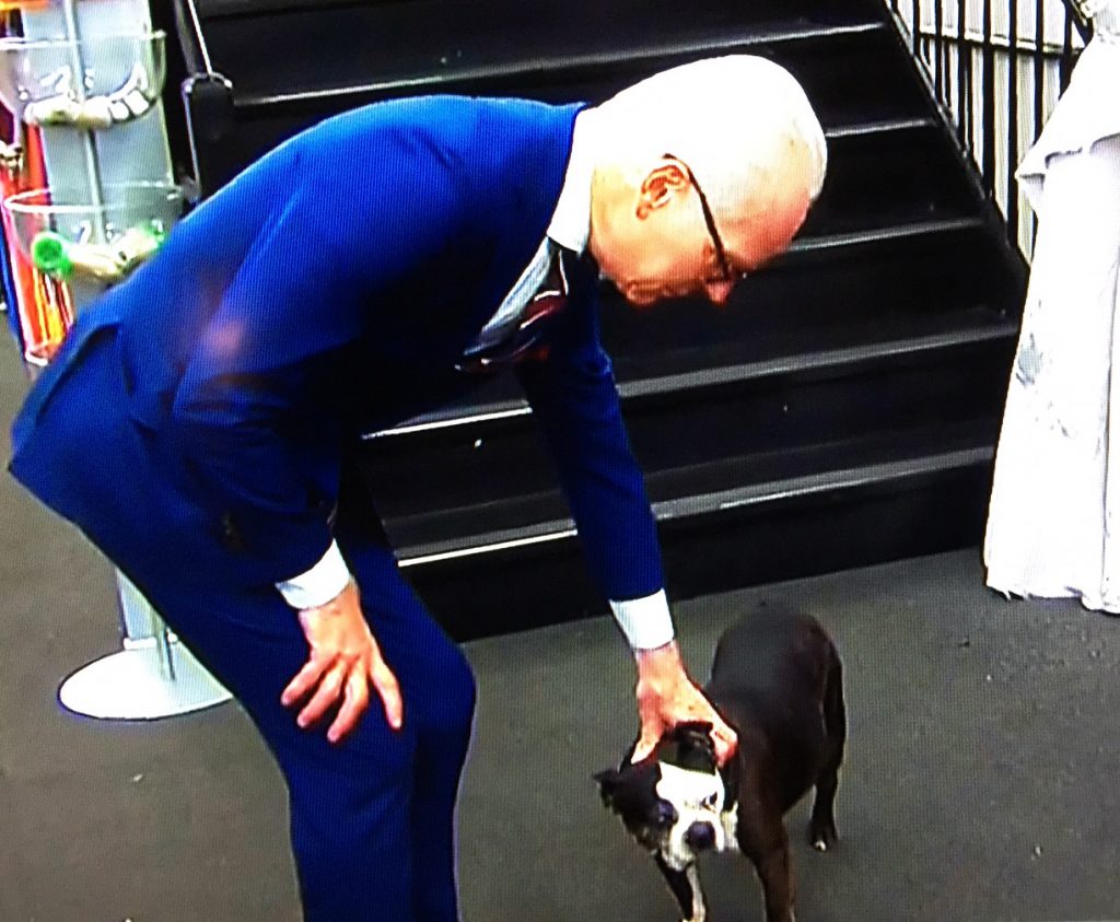
Tim Gunn pets Mood’s resident dog, Swatch.

Evol rules my world

Since I previously posted about food, let me spend a few minutes talking about a food I really like, evol.

I work 30 minutes from my home, and the distance makes it impossible to go home for lunch. I don’t want to spend too much on food, and the options near my workplace are limited. I also am sometimes limited on time for lunch, and I rarely cook dinner so have few leftovers. What to do? Frozen dinners.

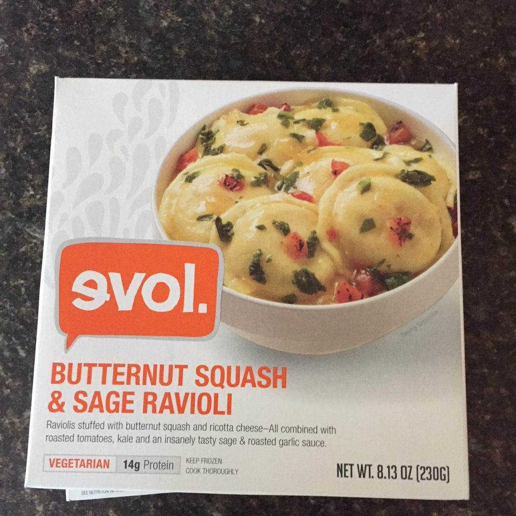
evol frozen dinners
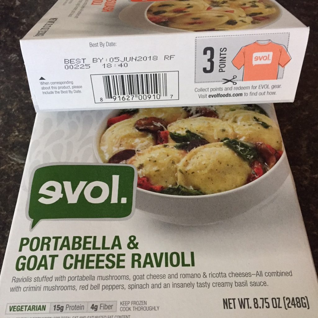
evol has a lot of vegetarian options include two versions of ravioli.
evol frozen dinners have points
Save the points on the box for cool tshirts and goodies. What a great branding idea.

Hey, I know it sounds awful, but they’ve come a long way. When I first started eating frozen food, the pre-made dinner options were pretty awful – high in calories and fat. Since that time, they’ve come a long way. The brand I especially like is evol. They have a variety of vegetarian options that I dress up with low calorie goodies like hot sauce, fresh tomatoes, and green peppers. They are relatively low in calories with each dinner clocking in under 400 calories. The lasagna and mac and cheese are higher, so consult the box.

Finally, they have an evol community option. Each box contains points printed on the box. Collect the points, and you can send your points in for cool t-shirts and other neat stuff. It’s great branding, and the community gear options are very nice.

#recommended

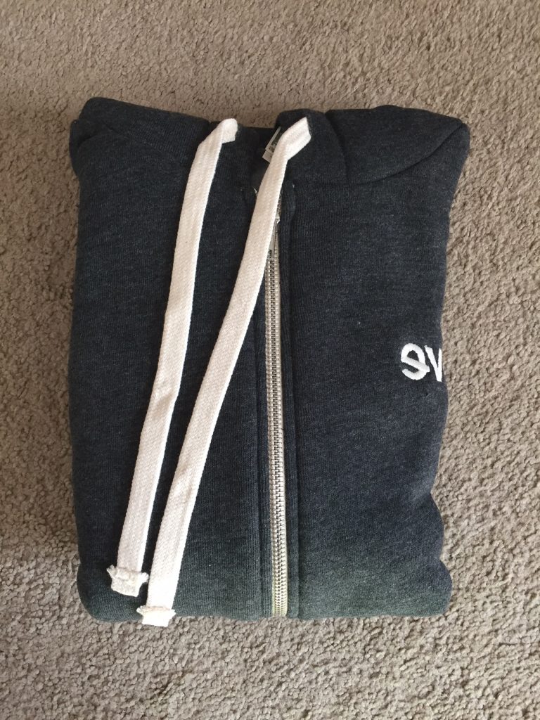
evol hoodie
I traded in 200 box points for this awesome hoodie. Even more great branding. Now I’m wearing their brand.

Some Brands Own Colors

Unlike some women in her generation, my maternal grandmother worked outside the home. Always. There was never a moment when she was a stay at home mother largely because my grandfather died before my father was born. Not a terribly independent person my nature, she didn’t have a choice, and she rose to what was a formidable challenge of single parenthood in the 50s. She’d work her entire life for a John Deere dealership. This meant many of our holiday gifts came from that storied American company with this green and yellow logo.

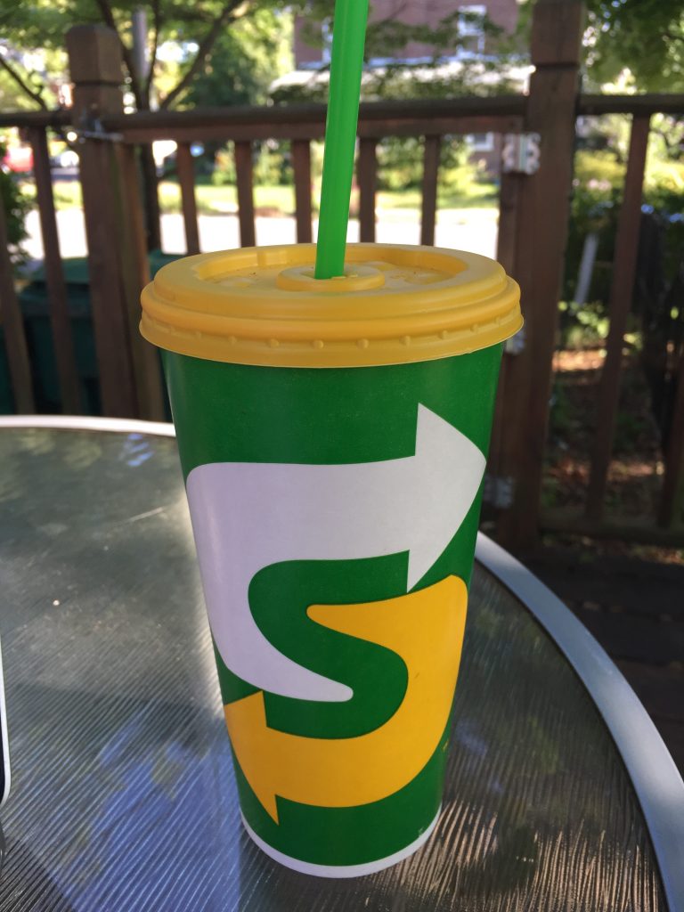
Enter Subway, who recently rebranded their stores in John Deere green and yellow. “Stores” is a stretch because the remodeled stores are really quite lovely. They kept the subway motif wall coverings that defined their earliest branding when they played on the concept of a literal subway.  However, they added more comfortable seating and earthen tones on the walls and tables. Some stores even have a purring fireplace and plush sofa if you have more than 30 minutes to spare at lunch.

The logo, however, is pure John Deere. Is it me? Take a look.

Subway's New Branding

I can’t say I dislike it entirely. The “S” is encased in arrows, which references both the moving subway cars of the original brand and the speed the stores want to be known for. The yellow references the previous logo, which is usually a sound idea in a rebrand. The green is a natural fit for a store that bills itself as healthy eating and offers largely healthy fare, but did it have to be *that* green?

Some brands just own colors, and I think John Deere is one of them. I can eat in Subway without thinking of lawn mowers, but I do get a whiff of nostalgia every time I pick up their cup. The straw, I will admit, is just lovely.

July 30 Update: More on Subway’s stores via GD USA.

Dos Mujeres

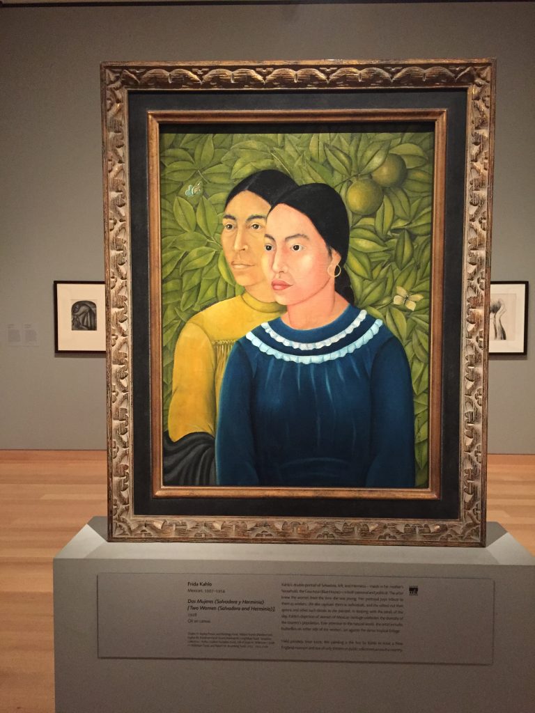
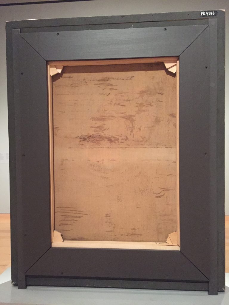
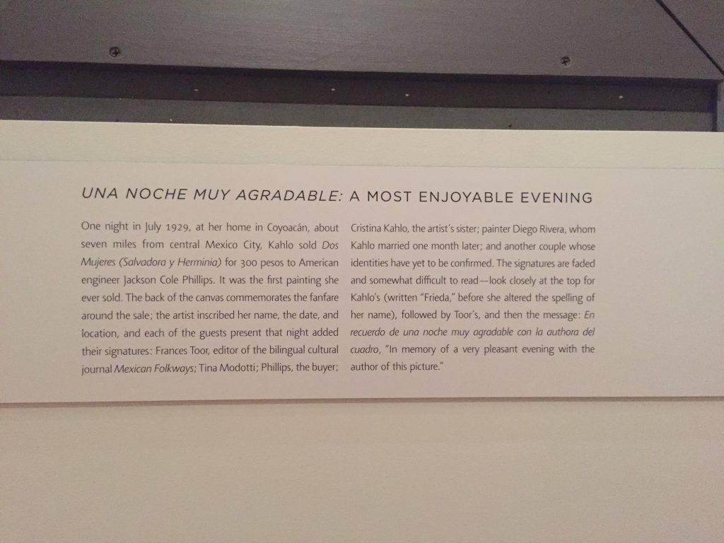
I recently made my second trip to the Museum of Fine Arts in Boston, and I enjoyed their recent acquisition, Dos Mujeres by Frida Kahlo. This was the first painting Kahlo ever sold, and it was mounted with the back exposed to reveal a lovely inscription by the artist and various friends including Kahlo’s soon-to-be husband Diego Rivera (the two married a month later): “En recuerdo de una noche muy agradable con la autora del cuadro” (“In memory of a very pleasant evening with the author of the picture”). Pro tip: Always ensure that a museum allows photographs. Most do provided you do not use a flash.

Frida Kahlo's Dos Mujeres
Frida Kahlo’s Dos Mujeres acquired in 2016 by the Museum of Fine Arts Boston
The back includes a lovely inscription, and the museum helpfully displayed it to include this detail.


The Friendly Toast

Finding the world’s greatest breakfast place is usually my husband’s job when we are on vacation. Breakfast is very important to him, and since we often skip lunch, he wants something substantial and good. This sometimes means an uncomfortably long early morning walk or a dead end when we find the perfect place opens too late. (We’re early risers.) In New Hampshire, we found this nifty place in Portsmouth, The Friendly Toast. It turns out the Portsmouth location is the mother ship as this is a chain now has outposts in Boston (Back Bay) and Cambridge. The menu was eclectic and vegetarian friendly, which is important for us. I had veggie biscuits and gravy for the first time ever.  The decor is pure kitsch to match the menu and the groovy staff. You can check out their decor on their website under “Our Gallery of Goodness.” Highly recommended.

Table Decoration Kitsch galore at The Friendly Toast

The Press Hotel

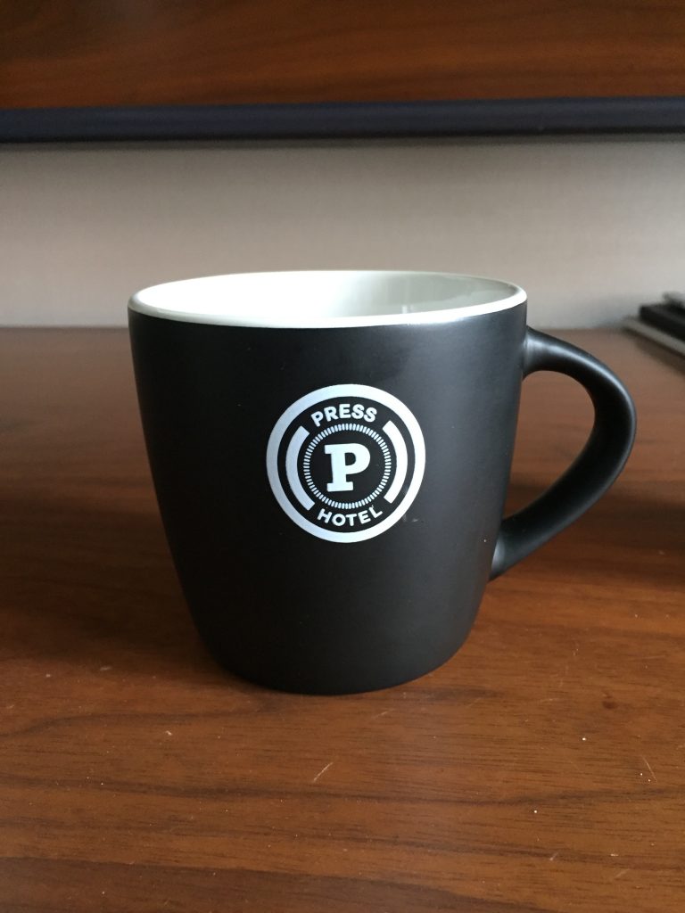
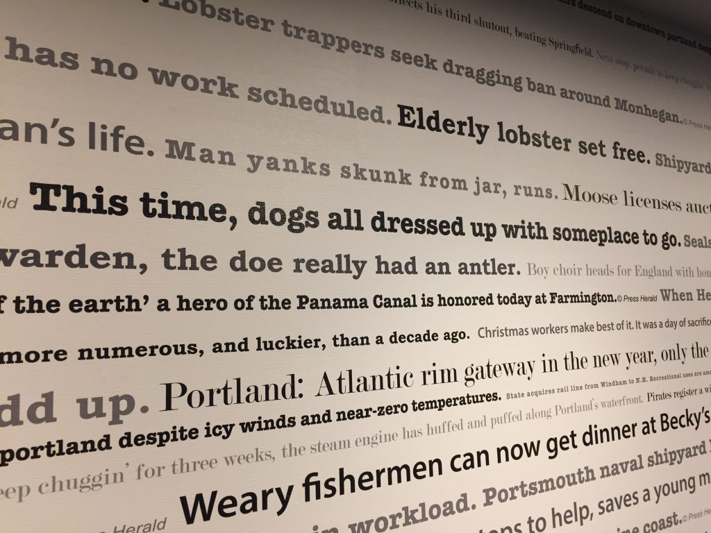
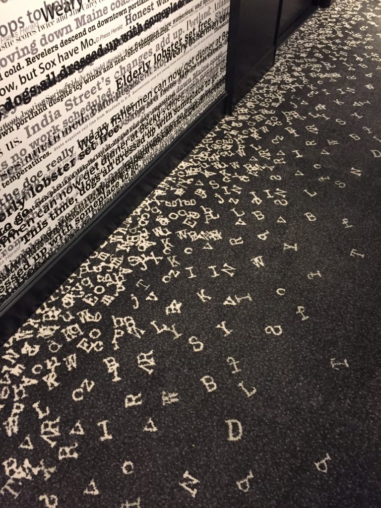
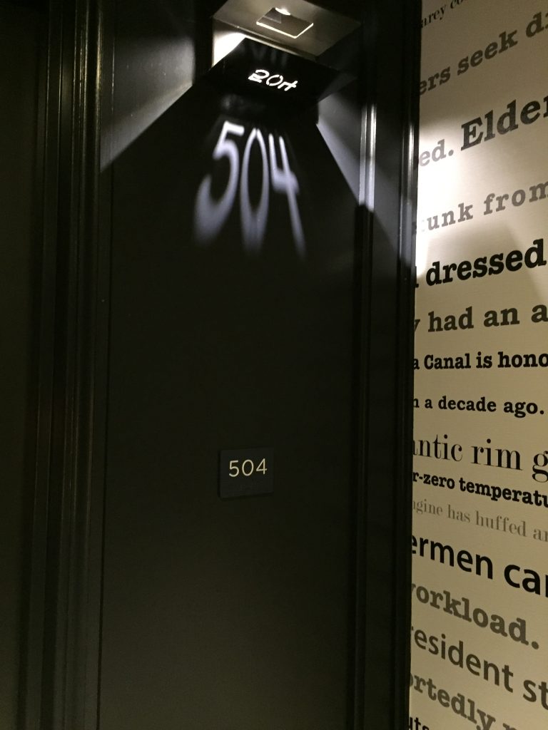
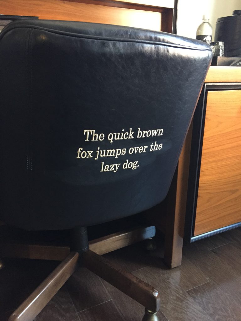
I just returned from a trip to New England that started in Portland, ME. My husband and I did some quick math and figured out it had been 8 years since we stayed in Portland. The Press Hotel was our first stop. This hotel did not exist on our last visit, and I found it utterly charming. It was housed in the former home of the Portland Press Herald, the largest newspaper in Maine. It operated here until 2009. The decorators included some completely wonderful type and print references throughout the building to reference its history. Highly recommended. Tips: Use the valet parking. It really is cheaper and easier than parking your own ride. They sell the lovely cup pictured below, but at $30, I wasn’t willing to risk it breaking in my luggage on the flight home.

Press Hotel Mug
Custom made cups in the room was a beautiful touch.
Accent wallpaper with type
This accent wallpaper in the hall referenced Portland and Maine.
Type on a carpet
That’s not an optical illusion. The type falls off the wall and onto custom made carpet.
Hotel room number
Hotel room numbers were projected via a clever light fixture. ADA compliant signs are underneath.
Type embroidered on a chair
A bit of filler text embroidered on the back of the office chair.

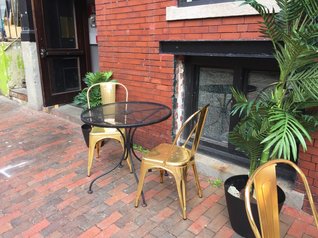
A Little Spray Paint

This little seating area was in Portland, ME. Someone took a can of spray paint to some inexpensive chairs and created a lovely little outdoor space on a budget.

Gold chairs
Someone spray painted these chairs for a rather lovely effect.

Custom t-shirts

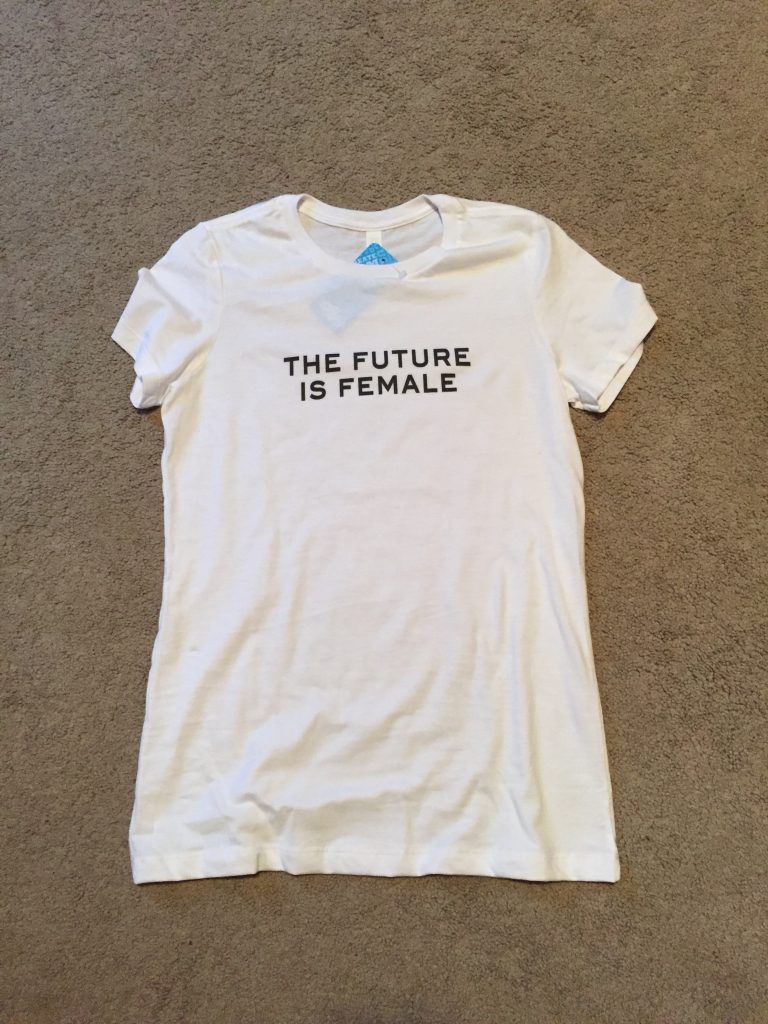
In leu of the “Cher’s Awesome T-Shirt collection” post that I did not yet write, here is a t-shirt I made with Uber Prints. Full disclosure: I cribbed this design after seeing it in Teen Vogue. I’m not exactly in their demographic, but I’m a Lauren Duca fan. I subscribe.  I pulled this image into Illustrator and matched the font. Take advantage of all the font tools in Illustrator to match any font. The font I started with was Blair TT Medium. I changed the tracking to 200 and the vertical scale to 150%. I changed the horizontal scale to 105%. Finally, I changed the font to a path and added a 2.5 pt stroke.  It’s a near perfect match.  If you’re really stuck, use the Font Identifier tool in Font Squirrel. Since I have hundreds of fonts, I prefer to match them whenever possible and avoid buying new ones.

I’ve also used Cafe Press for t-shirts. I can recommend both sites, but I’ll probably be back at Uber Prints in the near future to make some gifts.  This is a Bella Canvas t-shirt. It is very soft fitted t-shirt of nice quality. It’s a digital print, and the white t-shirt was slightly cheaper than a black or gray one.

The Future is Female